At the Ballet
1938
Lithograph
By Duncan Grant
This piece was created after the
works that were studied, but I believe it is very similar to the Post
Impressionism that VanGogh began to turn into abstract Expressionism. I think the piece is trying to express the
artist’s feelings and the general atmosphere of being at the ballet.
A lithograph is a form of printing,
and Duncan Grant’s piece seems to be very much influenced by the technique that
was used to create it. The shading is
done roughly and not at all blended or smoothed like an oil painting. There also seem to only be a few colors at
work in the piece—like he made several prints in various colors and layered
them on top of each other. The colors
are not blended, which of course is “with” the material and technique that the
artist is using.
The colors are saturated and the
light is glaring on the ballerinas so that almost all of their color has been
washed out and they are only described in white and gray. Throughout the whole piece Grant uses yellow
and blue, this, because they are complimentary colors, add to the incredible
brightness and vivacity of the work.
This piece clearly has a certain
style about it, and it—in my opinion—is like Toulouse Lautrec
that has been
inspired by Degas’ ballerinas.
It is
reminiscent of Toulouse Lautrec’s works he created as advertising posters
because of the small number of colors present and also the brightness of those
colors. The Degas homage is of course,
in the subject matter.
Upon first glance, the Grant piece
seemed like a work of impressionism, with the heavy emphasis on color and the
“everyday” subject matter. The lines of
color in the piece—most noticeable in the background behind the
ballerinas—appear to have been dashed down quickly on the plate, like a sort of
‘first impression’. The lines are full
of movement and therefore energy. This is
clearly echoing the dancing of the ballerinas onstage.
But the date of 1938 doesn’t fit
with Impressionism. There is, however,
absolutely no reason why Grant couldn’t have been inspired by impressionism.
Distinct lines of vibrant color are
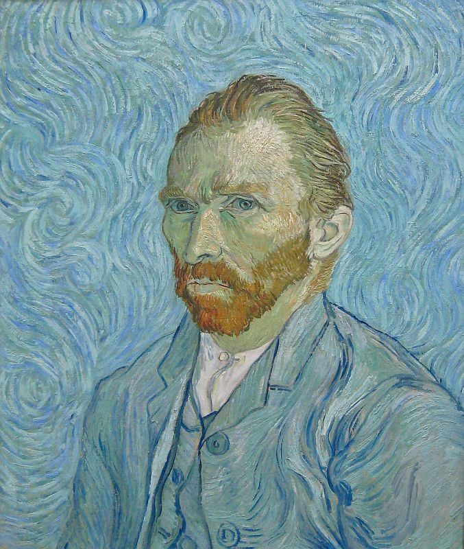
reminiscent of VanGogh’s style.
VanGogh
was interested in expressionism, and perhaps there is some of that in Grant’s
work as well. The jittery lines of
complimentary colors could be indicating the artist’s own excitement about
seeing the ballet. Perhaps he is also
trying to communicate the visualized version of the music that the ballerinas
are dancing to.
The scribbles continue out into the
foreground as well, implying that the audience is excited as well. Indeed, many of them seem to be turned toward
in each other as if in conversation. One
man, on the far left of the piece has turned completely around in his seat and
is looking back out at the viewer. Maybe
this is a little self-portrait? Or even
someone Duncan Grant knew?
I’m not sure why these people seem to be paying more attention to each other
than to the ballet. Perhaps the rules of
etiquette were different in 1938?
Perhaps it was common to engage in conversation about the performance
they were watching, while they were watching it. Maybe the audience is just that excited, it cannot be
contained.
The ballerinas themselves have been
placed in dynamic poses—they are not simply standing onstage—they have been
captured in the most dramatic poses that they can be in. It almost looks disorganized, like the artist
took different sets of people that weren’t onstage at the same time and placed
them together for the piece. It doesn’t
seem quite realistic—what good choreographer would want so many equally
interesting things happening at the same time?
There is so much energy that it can’t be conveyed in a single dance
scene.
The vibrancy and energy of the piece
are bursting out of it, and clearly express excitement and spectacle. By using complimentary colors juxtaposed
right next to each other and tightly spaced scribbly lines throughout the
piece, Duncan Grant successfully shows his audience what it feels—and maybe
even sounds like—to be at the ballet.


No comments:
Post a Comment